
Wednesday, 7 December 2011
Wednesday, 30 November 2011
Tuesday, 25 October 2011
Aaron Yellowlees Plumbing


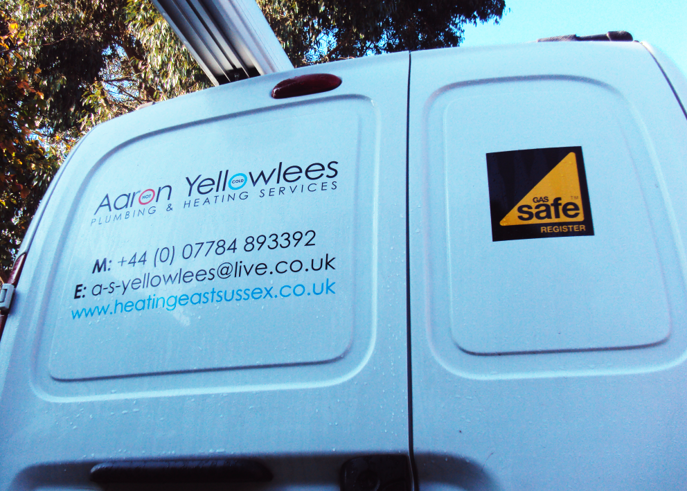

A small branding project for a family member. A nice and simple typographic treatment, hot and cold idea taken from the classic chrome tap knobs.
If its plumbing you want. Aaron is the man.
www.heatingeastsussex.co.uk
Friday, 9 September 2011


Ruby Blu Wallpaper design

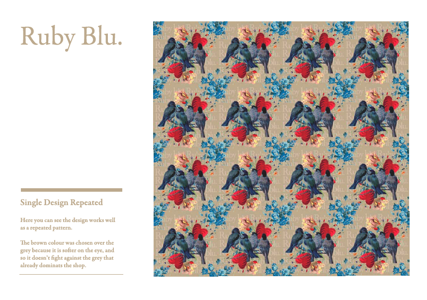

Custom designed wallpaper for Ruby Blu, girt shop in north london.
A very different and fun project,
New designs for Forget Me not.

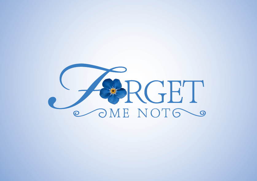

New designs:
After having feedback from the client, I was asked to go down for the 'flower' route, using its colours, instead of my own interpretation with the chocolate brown and pink.
Tuesday, 6 September 2011
Brighton Skateboards logo (Negetive Space)


Brighton Skateboards:
Using negative space as the concept of this design, this works well due to the chosen font. The characters are very bold and was easy to spot the positive and negative within these shapes.


Thurstons Preserves Branding


Thurstons Branding:
"It sounds a little too much like 'Thorntons'...apparently. When in fact its the surname of the maker (Chloe Thurston). The logo is quite art deco, looks classy, and the little butterfly was chosen specifically to represent 'Organic' and 'the country side'. Butterfly's are free, they evolve, grow, they come and they go. I thought it was an ideal way to represent what the preserves are all about.
I wanted the branding to complement the product, Although the outcome of the project could have been more creative, the budget was small to get going, but as the budget will grow, more creative elements will come into play, for example packaging and showcasing.
So some exciting times to come for Thurstons Preserves, the makers and I have a lot of great ideas in which to create for the future for sales and advertising.
Thurstons Preserves


Thurston Preserves:
Personally I feel the project has gone really well, clients are very happy with their branding and label designs. This project was a great opportunity for me to get my work out there. These Preserves are in a well known local superstore based in the South East England called "Jempsons", and a few local Coffee shops.
They are selling brilliantly, they taste great and look great as a set.
There has been comments that there is too much black, but myself and the client agreed that the colour sat well better on black than it did white, it looked 'cheap' to have it white. The black is more subtle on the eye, and with complementing lids, it all comes together. Also the immense colour that come from the preserves themselves, white or any other colour would have been over kill.
The generic design works for all flavors without them having to fight against each-other.
P.s Open to any critical comments.
Thanks
Forget Me Not (Gift Shop Identity) 1st ideas


Forget Me Not:
First logo options for the client, which are under the process of being analyzed. Forget Me Not is an old gift shop located in the heart of Rye (East Sussex) next to the church.
Updates will come back on the blog when the client has analyzed them.
Saturday, 3 September 2011
Brand Logo (Brighton Lonboards)


Brighton Longboards
The logo design I have created, is purely a typographic exercise. The logo has been created on the basis that it can work for the brand logo, and the brand stamp. Through my market research I recognized that most skateboarding, surfing, Longboarding, brands of this culture, they en corporate the brand font with a brand symbol. You can see how well this logo works within context throughout this presentation. I have created a symbol that compliments the chosen font, where you can see the break in the ‘B’ and the ‘L’. The logo is very adaptable and can be used within all types of media and can look great in a wide range of colours. Everyone has their own opinion as to what colour should suit best, either to compliment its surroundings, or a colour that suits the culture of the brand.
It was a shame that this design was not used having won the competition, however it was a fun creative exercise and I enjoyed working on it.
The name was changed to 'Brighton Skateboards' which I then created some designs in my own time.

Stationery Design (Brighton Longboards)

Business Cards
The business card below does not just act as a tool for information, it also has interaction. As you can see I have created the logo so that the consumer can
create a mini stencil. I wanted to capture the life style of a skater, on numerous occasions, stenciling or graffiti will accrue at skate parks or on the street, although street art is not well recommended, having the identity performed in this way will engage the consumer into the brand.


50 Reasons not to date a graphic designer!
50 reasons not to date a graphic designer
1. They are very weird people.
2. There are billions of them in the world, like colors on the screen of your computer.
3. They will analyse conversations in layers.
4. You will spend the day assembling furniture from IKEA.
5. They drink and eat all kinds of weird shit just because they like the packaging.
6. They hate each other.
7. You’ll come out the last out of the movies because you have to see the full list of credits.
8. They cant change a light bulb or without making a sketch.
9. They **** up all the tables with their cutters.
10. They rather study the paisley pattern on your outfit than listen to what you have to say.
11. They will fill your house with magazines and whatever is out there that has drawings.
12. You never know if it is really an original or a copy.
13. They make collages with your photos.
14. They do not know how to add and subtract, they just understand letters.
15. They idolize people who nobody knows and speak of them as if they were his colleagues.
16. They take pictures almost daily and all are cut in weird shapes.
17. They ask your opinion about everything but they do whatever they want.
18. Everything is left justified, right or center unless they arrive late.
19. They hate Comic Sans with the same passion they love Helvetica.
20. They use iPhone for everything, because everyone has one.
21. You can not decorate the house without consulting them.
22. They steal street signs.
23. Always carry their hands painted with something.
24. They buy dolls unfinished for them to paint.
25. Everything becomes something other than what it really is: cards as tickets, cards as …
26. When arguing, you will be nicknamed like the OSX spinning wheel (not affectionately)
27. Do not know how to dress without consulting the Pantone book.
28. They hate Excel.
29. They read comics.
30. They want to save the world only with a poster.
31. You will spend the day brainstorming.
32. On vacation they will take you to countries that you do not know exist and have no beach.
33. Museums are their second home.
34. They know more positions than the Kamasutra.
35. They can’t go to a restaurant without secretly critiquing the menu design.
36. They listen to music you have never heard of.
37. They can´t cook a normal dish, they always have to experiment with new ingredients.
38. They read rare books: stories of children, Semiotics …
39. When you are going to tell you something, everyone has read it in their facebook and twitter.
40. They have own iPods before you knew they existed.
41. The orgasm they remember is when they heard that Adobe was acquiring Macromedia.
42. They have their own shops just for them and there are the most expensive in the city.
43. They want to spend all the money in the Apple Store.
44. You will never understand their gifts.
45. They see ordinary objects and laugh.
46. You wake up in the middle of the night hearim them screaming “When is the deadline?”
47. They see CMYK and RGB like Neo sees the Matrix.
48. They dream of the day nobody will make a single change to their designs.
49. They rather pay for a font than for a special birthday gift.
50. They are always sleepy because they work 24/7.
Friday, 5 August 2011
Mark Making: Found this


Further into my investigation into mark making I cam across this cleaver interaction campaign which was launched to help motivate citizens to throw garbage into waste cans and not on the streets. The organizers cleverly created 16 game stations around various bins that included a maze, hopscotch and other activities.
This is quite away from the type of mark making that I am investigating, but it shows how the use of paint can interact with society.
Subscribe to:
Posts (Atom)