Tuesday, 20 April 2010

Work experience "Spread-design"


The brief was to create a layout and design a wine a drinks list for a bar in London called libre. I had four pages of information to place onto two pages, this was difficult, but got there in the end. Unfortunately the menu's were not used, they were re-designed due to the amount information on the pages. The bar should have realised that there was far too much info on the lists.

Magazine design brief


This brief was to Name, and create your own magazine. We had to design the layout, chose what went on the front cover...and this was one of my two designs. The magazine was to be focused at the older generation, this was the weakest of the two designs, but i still feel this is successfull.

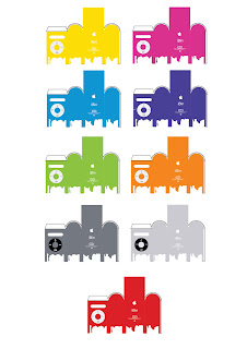
Bins Brief


The brief was to make dull looking bins more visually attractive. I believed this would be a good opportunity to do another itunes ad. My idea was to advertise the new ipod Nano. My slogan was "choose the color that suits you" this would create a live investigation to what colour would be the publics favorite. Also in other ipod Ads, the ipods have paint dripping off them, so I thought this would be great if the bins would be placed outside of a large apple store, with the ipod coloured footprints leading into the store.

Monday, 19 April 2010

My Ipod AD


This particular ad is one of many. This was for a final major project for my National diploma. The idea behind it was to create a new selling point for one that already exists. To me music is a free, and effective way to enhance a bodies performance. This was my new selling point. "Enhance your body with your play list, chose your songs, chose ipod nano".

Lost Typography